Heatmap
10 Sep 2021I recently had some data which I wanted to display in something like a heatmap. Because we humans are much better at spotting patterns on a visualization than just raw numbers. The data I was working with is a date with a intensity value.
This is in the form of a csv file which looks like this:
date,value
...
14-Jul-2021,
15-Jul-2021,1
16-Jul-2021,
17-Jul-2021,
18-Jul-2021,1
19-Jul-2021,2
20-Jul-2021,2
...
25-Jul-2021,2
26-Jul-2021,1
27-Jul-2021,
28-Jul-2021,1
29-Jul-2021,1
30-Jul-2021,
31-Jul-2021,
...
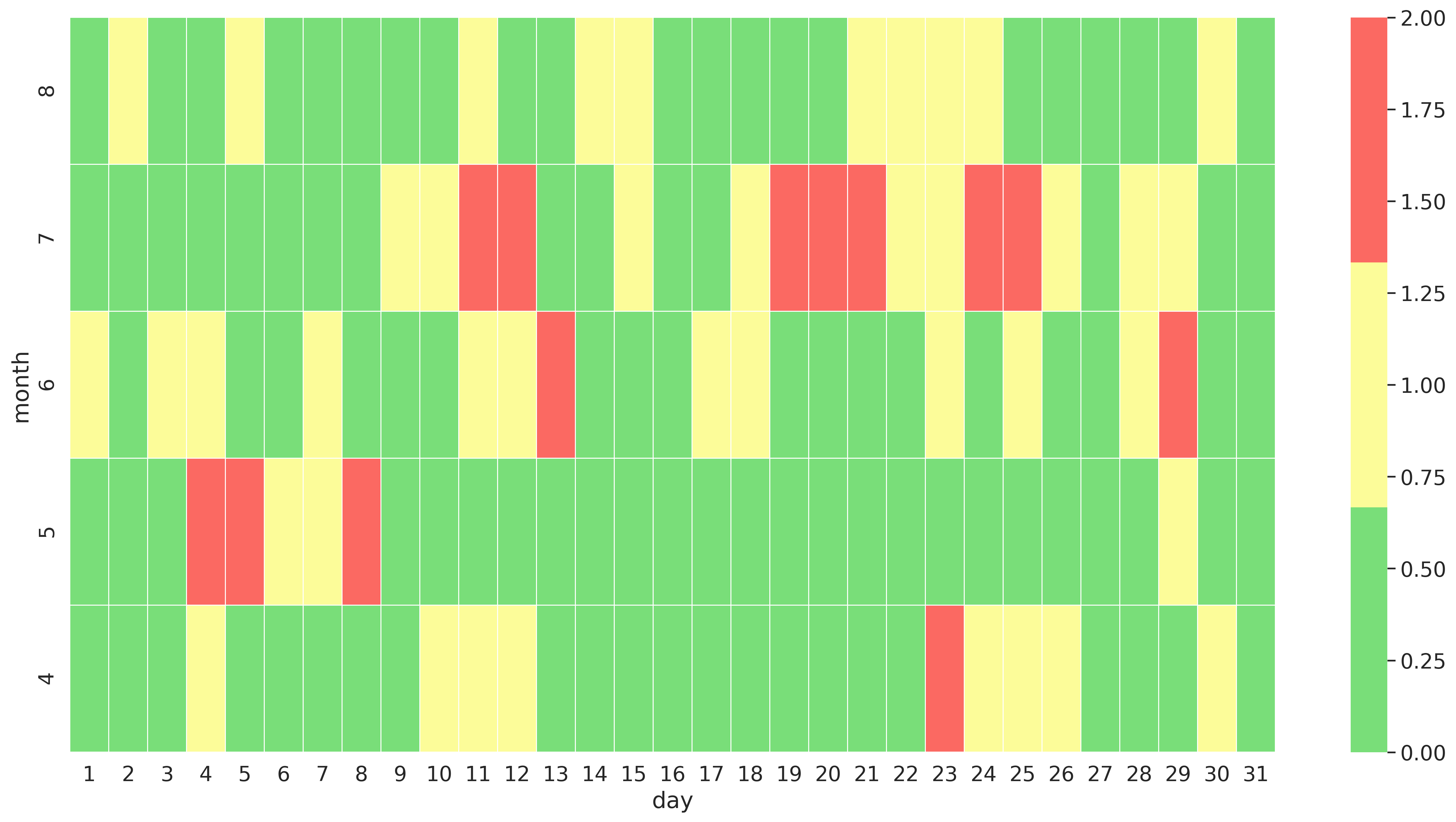
The idea is to display the value which is in this case not present (0), 1 or 2 on a heatmap which uses month and day as x and y axis.
To achieve this a few steps are needed:
- Load the data from the csv file
- Convert the date string to a data
- Create two new columns, one with the day and one with the month
- Create a pivot table with month, day and the value
- Use the pivot table in reverse as input for the [
seaborn.heatmap]
And thats all that is needed. To create a heatmap which looks like this:
If you are interested in the actual code I used to create this you can checkout the jupiter notebook I put into a git repository: jupiter-notebook-python-heatmap